Chat container
The chat container is the foundational layout for building chat experiences.
Use the AI chat for standard AI conversations. It builds on the chat container with predefined AI-specific behaviors.
Usage
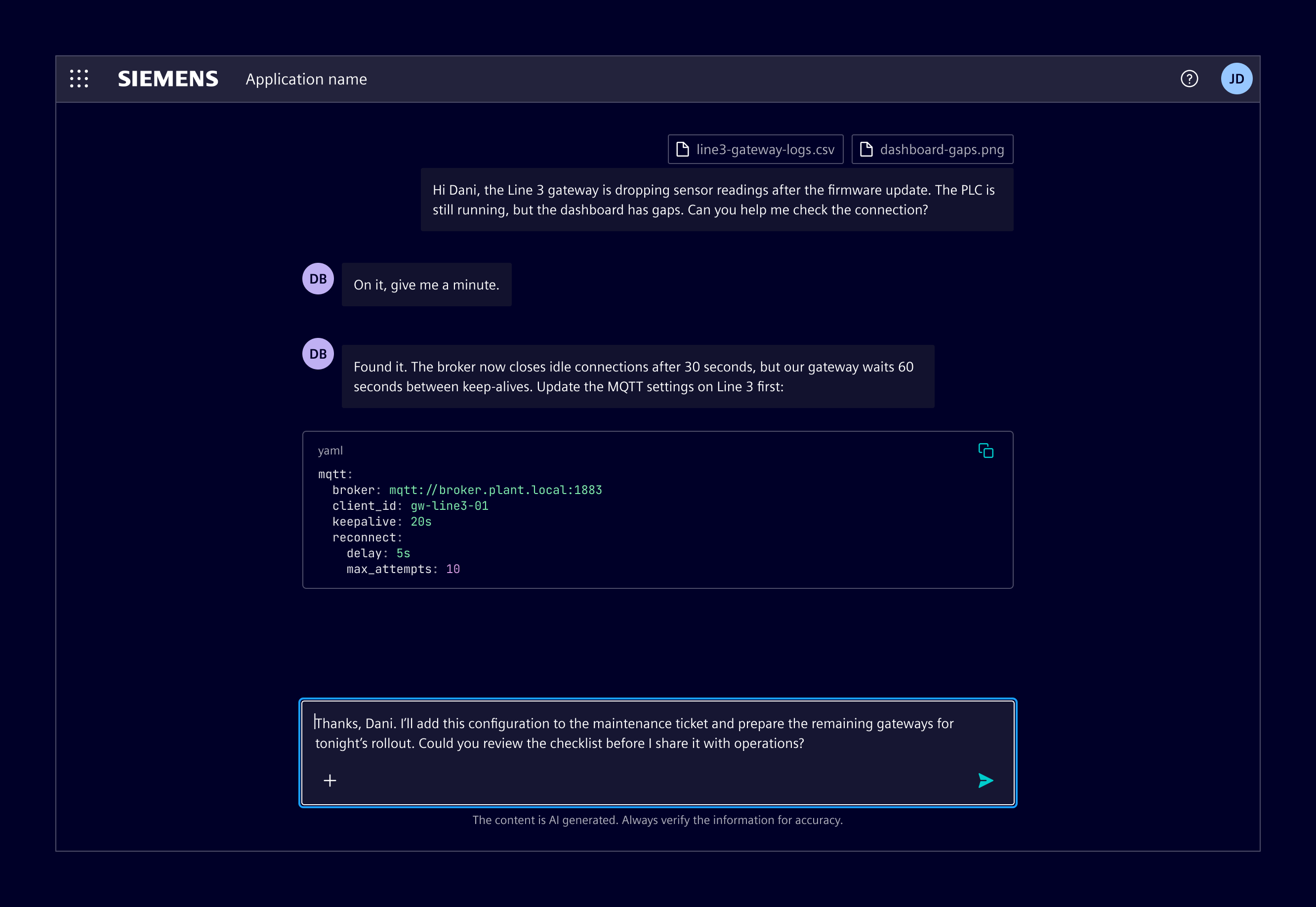
The chat container is a flexible wrapper that provides slots for chat messages, the chat input, status notifications, and other chat elements. It handles their placement, sizing, and scrolling.
It's also the base of the AI chat.
When to use
- When building a chat interface, such as messaging, support conversations, or assistants.
Design
Elements
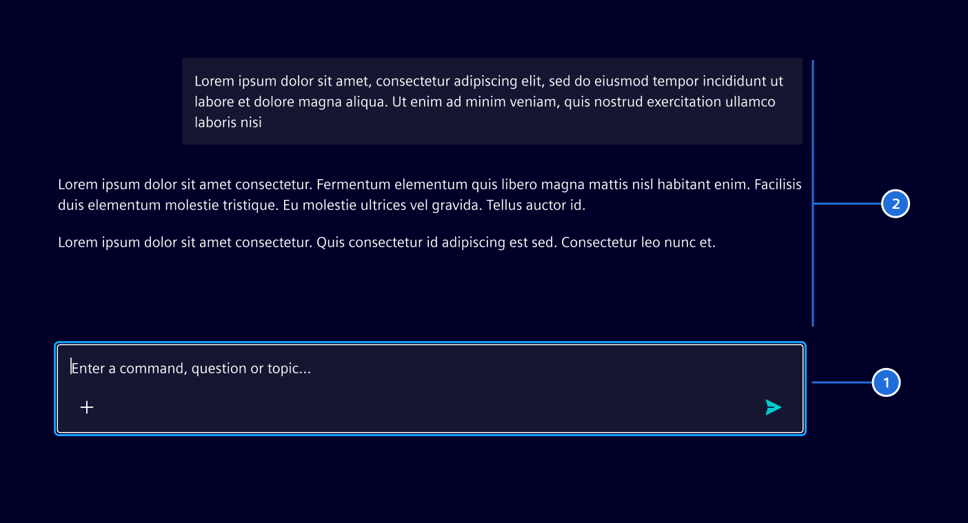
The basic chat container consists of a chat input and a message area. Additional elements, such as status notifications, can be added depending on the use case.
Layout
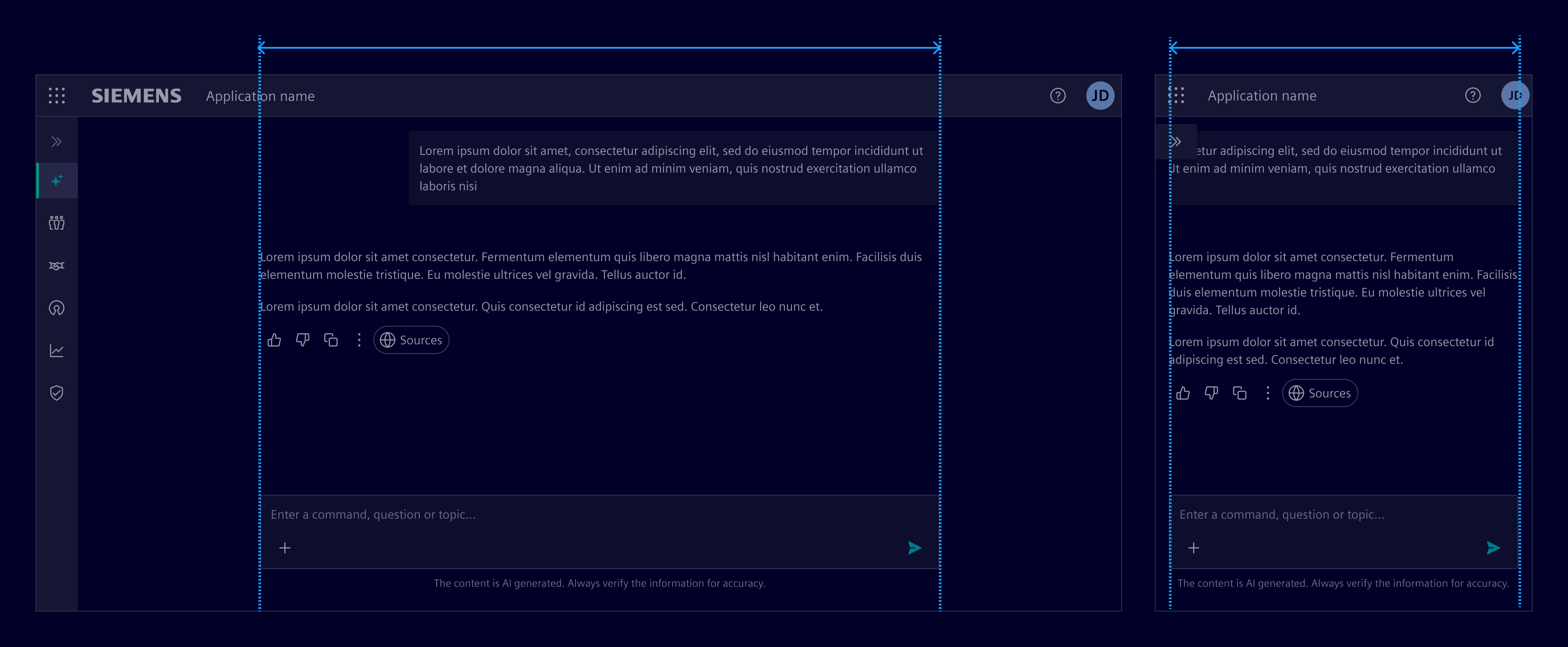
The content area has a maximum width of 720px. It scales fluidly on smaller screens and remains centered on larger ones to maintain readability.
Code
Use this base container with the chat messages to build custom chat message interfaces.
The si-chat-container component is a wrapper component, it has slots for chat messages and a chat input.
The slots are:
- default -> chat messages or initial screen (
si-welcome-screen) si-chat-input/siChatContainerInput (helper directive)-> For the input (whether default or custom).si-inline-notification-> Slotted above the input for displaying the status.
SiChatContainerComponent API Documentation
si-chat-container A declarative container component for displaying a chat interface with automatic scroll-to-bottom behavior.
This component provides the layout and styling for a chat interface, managing scrolling behavior to keep the newest messages visible while respecting user scrolling actions. It automatically scrolls to the bottom when new content is added, unless the user has scrolled up to view older messages.
Use via content projection: - Default content: Chat messages displayed in the scrollable messages container or a welcome screen (empty state). - si-inline-notification selector: Notification component displayed above the input area - si-chat-input or [siChatContainerInput] selector: Input controls for composing messages
See - SiChatInputComponent: link not resolved for the chat input wrapper component - SiChatContainerInputDirective: link not resolved for other input controls to slot in - SiAiMessageComponent: link not resolved for AI messages to slot in - SiUserMessageComponent: link not resolved for user messages (in AI chats) to slot in - SiChatMessageComponent: link not resolved for the chat message wrapper component to slot in other messages
Input Properties
| Name | Type | Default | Description |
|---|---|---|---|
| colorVariant ¶ | string | 'base-0' | The color variant to apply to the container. |
| noAutoScroll ¶ | boolean | false | Disables automatic scrolling to the bottom when new content is added. |
Attributes and Methods
| Name | Type | Default | Description |
|---|---|---|---|
| focus() ¶ | () => void | Focuses the messages container element. | |
| scrollToBottom() ¶ | () => void | Scrolls to the bottom of the messages container immediately. This method forces a scroll even if the user has scrolled up. | |
| scrollToTop() ¶ | () => void | Scrolls to the top of the messages container immediately. |
Except where otherwise noted, content on this site is licensed under MIT License.